Plans Comparison Grid is a clean and structured section designed to showcase multiple pricing plans or service packages in an easy-to-compare layout. It helps visitors quickly understand the differences between plans by highlighting key features, pricing details, and benefits in a visually organized grid.
Fully responsive and easy to customize, this module allows businesses to present pricing options clearly, guide users toward the right plan, and increase conversions with a modern and user-friendly comparison design.
Key Features Plans Comparison Grid Module :
✅ Fully Responsive: Works seamlessly on all devices (desktop, tablet, mobile).
✅ Multiple Plan Columns Support: Display multiple pricing plans side-by-side in a clean comparison grid.
✅ Customizable Design: Adjust colors, sizes, and spacing to match your website's style.
✅ Lightweight & Fast: Optimized for speed and performance.
✅ Monthly / Yearly Pricing Toggle: Allow users to switch between monthly and yearly pricing easily.
How to Set Up the Plans Comparison Grid Module in HubSpot :
In the main dashboard, go to the ‘Content’ tab and select either ‘Website’ or ‘Landing Pages,’ depending on where you want to add the section. This lets you choose the right location for managing or updating your content.
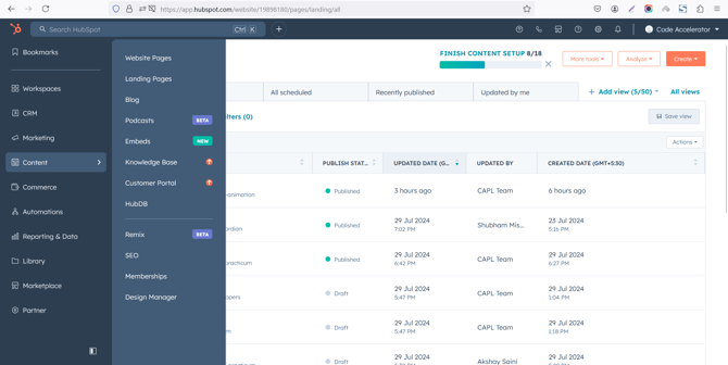
Select the page where you want to apply the module.
-Feb-13-2026-06-36-17-9723-PM.png?width=670&height=339&name=Screenshot%20(20)-Feb-13-2026-06-36-17-9723-PM.png)
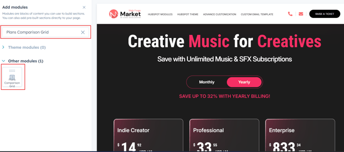
Search for "Plans Comparison Grid" and drag and drop the module into the desired location on your page.
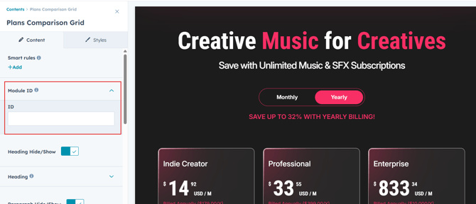
Module Defaults Options:
Layout ID :
To enable smooth scrolling for a CTA, assign an ID to the target element, reference that ID in the anchor link's href, and clicking the CTA will smoothly scroll the page to the section.
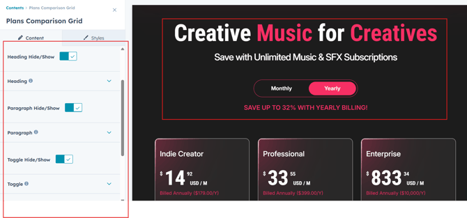
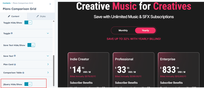
Heading/Description, Toggle & Save Text:
Easily customize the content in your module by modifying the "Heading," "Description, Toggle and Save Text. You can also choose to hide the section if desired, giving you complete control over the presentation and functionality of your content.
Options :
- Heading & Description Show/Hide Toggle
- Toggle Show/Hide
- Save Text Show/Hide
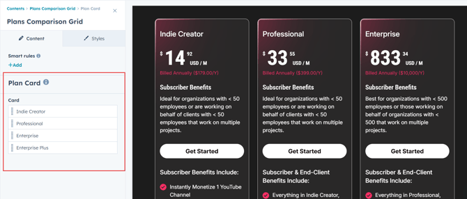
Plan Card:
You have the flexibility to modify the Plan Card. And you can add max 4 plans.
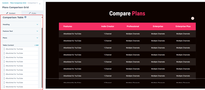
Comparison Table:
You have the flexibility to modify the Comparison Table. And if you hide the popup CTA, the popup table will automatically be hidden.
jQuery Add/Remove :
Users can add or remove jQuery JavaScript as needed, providing flexibility to enhance functionality or optimize performance based on their requirements.
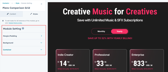
Module Style Options:
Module Setting :
Adjust the margins, padding, background colors, and container width to customize the module's appearance. This flexibility lets you refine the layout and aesthetics, creating a visually appealing, functional, and user-friendly design.
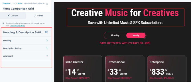
Heading & Description Setting :
Users can customize the spacing of the heading and adjust its typography, including color, font size, weight, and line height. These settings apply to both mobile and desktop views, ensuring a personalized and visually cohesive design across all devices.
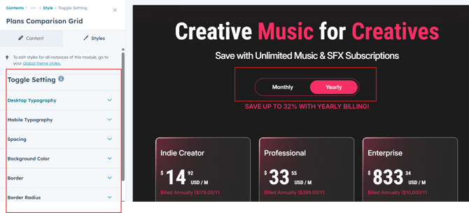
Toggle Setting :
Users can customize the Toggle background color, line height, and spacing . They can also adjust text transform, alignment, width and as well as add active color for a more dynamic design.
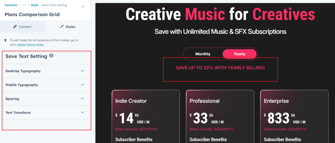
Save Text Setting :
Users can customize the spacing of the text and adjust its typography, including color, font size, weight, and line height. These settings apply to both mobile and desktop views, ensuring a personalized and visually cohesive design across all devices.
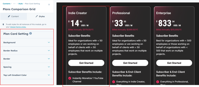
Plan Card Setting :
Users can customize the plan card style by adjusting the background color, border thickness, and border style to match their design preferences. Additionally, they can control the corner radius and spacing (padding and margin) to create a clean and well-structured popup layout that displays perfectly across devices.
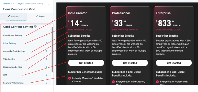
Card Content Setting:
Users can customize the card content style by adjusting the all content to match their brand identity. They can control font size, colors, borders, and spacing to create a clean, user-friendly form that improves readability and encourages more submissions.
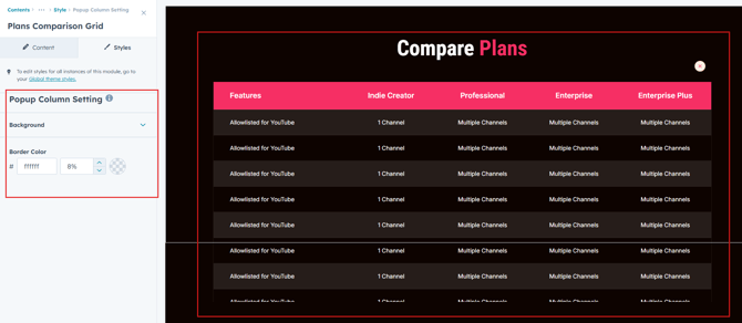
Popup Column Setting :
Users can customize the popup column style by adjusting the background color and border style to match their design preferences. to create a clean and well-structured popup layout that displays perfectly across devices.
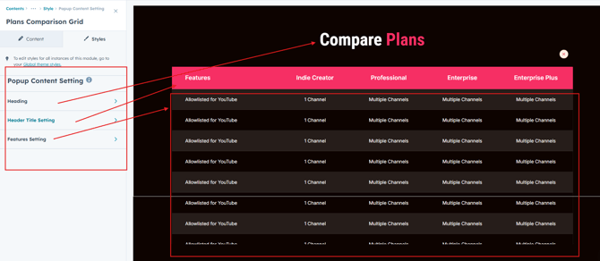
Popup Content Setting:
Users can customize the popup content style by adjusting the heading typography, and to match their brand identity. They can control font size, colors, borders, and spacing to create a clean, user-friendly form that improves readability and encourages more submissions.
We hope you enjoy using plans comparison grid module to create a seamless experience for both your users and your marketing team. At Code Accelerator, we're committed to ensuring your HubSpot experience is exceptional. If you need a custom HubSpot module or require a tailored HubSpot CMS or CRM setup, please don’t hesitate to Contact Us.