
Interactive Flip Feature Cards Module helps you showcase features, services, or key information in an engaging and interactive flip-card layout. Present front and back content with smooth animations, customizable designs, and compelling visuals to capture visitor attention. Fully responsive and easy to customize, it's designed to enhance user engagement and create a modern browsing experience.
Key Features Interactive Flip Feature Cards Module :
-
Interactive Flip Card Animation: Create engaging front-to-back card flip effects that capture visitor attention.
- Smooth Hover Effects : Engage visitors with fluid hover animations that create an interactive and polished browsing experience.
-
Responsive Design: Adjusts seamlessly across devices, from desktops to mobile screens.
-
Customizable Styles: Fully customizable with CSS variables for themes, fonts, colors, and animations.
-
Performance Optimization: Lightweight animations optimized to ensure smooth interactions without lag.
- Multiple Card Support : Display multiple flip cards in a fully responsive layout, making it easy to showcase features, services, or solutions in one interactive section.
How to Set Up the Interactive Flip Feature Cards Module in HubSpot :
In the main dashboard, navigate to the ‘Content’ tab and select either ‘Website’ or ‘Landing Pages’, depending on where you want to add the section. This allows you to choose the appropriate location for managing or updating your content.
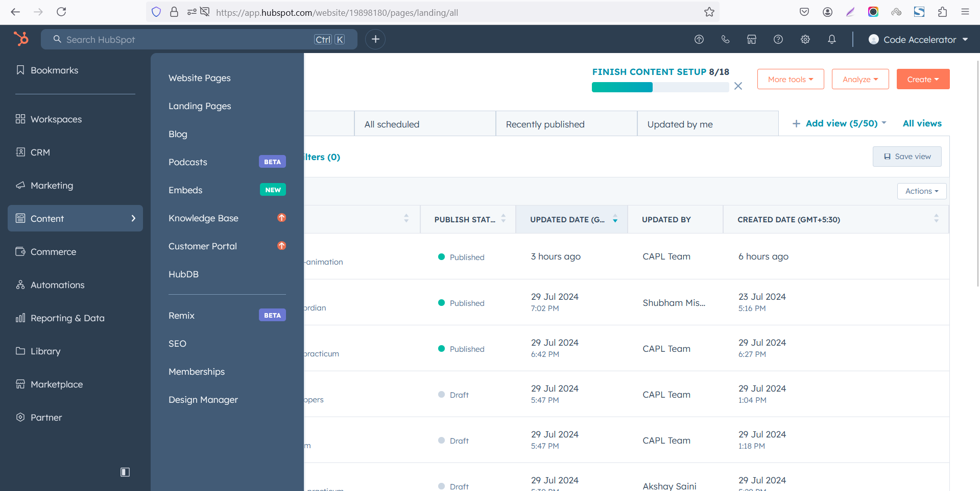
Select the page where you want to apply the module.
-Feb-13-2026-06-36-17-9723-PM.png)
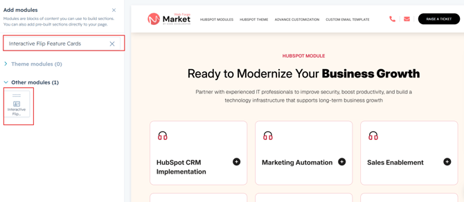
Search for "Interactive Flip Feature Cards" and drag and drop the module into the desired location on your page.
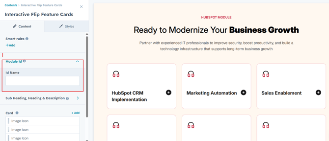
Module Defaults Options:
Layout ID :
To enable smooth scrolling for a CTA, assign an ID to the target element, reference that ID in the anchor link's href, and clicking the CTA will smoothly scroll the page to the section.
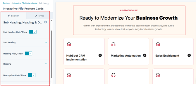
Sub Heading, Heading & Description :
Easily customize the content in your module by modifying the "Sub Heading", "Heading," "Description. You can also choose to hide the section if desired, giving you complete control over the presentation and functionality of your content.
Options :
- Heading/Description & Sub Heading Show/Hide Toggle
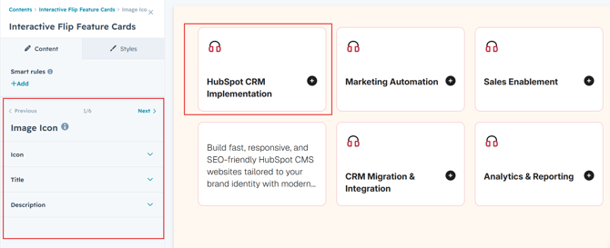
Content Columns :
Users can customize each column by adding an icon, title, description, and image to present key information in a visually engaging way. Additionally, they can replicate columns as needed to match their content requirements, creating a flexible and visually cohesive layout suitable for showcasing features, services, products, or other important content.
Module Style Options:
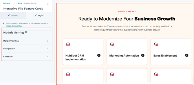
Module Setting :
Adjust the margins, padding, background colors, and container width to customize the module's appearance. This flexibility lets you refine the layout and aesthetics, creating a visually appealing, functional, and user-friendly design.
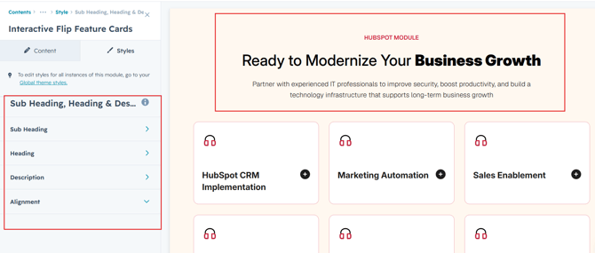
Sub Heading, Heading & Description Setting :
Users can customize the spacing of the heading, as well as adjust the typography for the sub heading, heading and description. This includes modifying the color, font size, weight, and line height for both mobile and desktop views, allowing for a personalized and visually cohesive design across all devices.
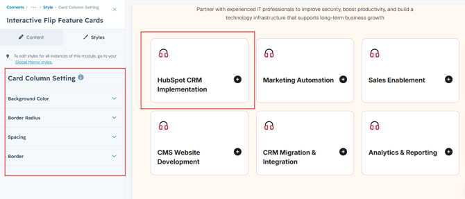
Column Section Setting :
Users can customize column spacing and adjust the background, border, border radius to create their desired design style.
Column Content Setting :
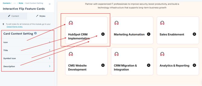
Users can customize the icon, title and description typography by adjusting font size, line height, and spacing for both mobile and desktop views. They can also modify text transform.
We hope you enjoy using interactive flip feature cards module to create a seamless experience for both your users and your marketing team. At Code Accelerator, we're committed to ensuring your HubSpot experience is exceptional. If you need a custom HubSpot module or require a tailored HubSpot CMS or CRM setup, please don’t hesitate to Contact Us.