
Horizontal Slide Feature Card Module helps you present your features, services, products, or key highlights in an interactive horizontal sliding layout. Showcase engaging content with icons or images, compelling titles, and descriptions that capture visitor attention and improve content presentation.
Fully responsive and highly customizable, this module is designed to enhance user engagement, create a modern browsing experience, and seamlessly integrate with your HubSpot website.
Key Features of a Horizontal Slide Feature Card Module :
✅ Interactive Horizontal Slide Layout – Showcase features, services, or products in a smooth, engaging horizontal card slider.
✅ Multiple Card Support – Add and manage unlimited feature cards to present content in a structured layout.
✅ Slide Arrows Option – Optional navigation arrows enhance usability.
✅ Modern & Clean Design – Sleek, contemporary styling fits perfectly into any modern website.
✅ Easy to Edit – Quickly customize content, styles, and settings without hassle.
✅ Easy to Integrate – Simple setup and integration into any page or theme.
✅ Optimized for Performance – Lightweight and fast for smooth transitions and loading.
✅ Smooth Animation Effects - Built-in fade or slide animations enhance visual engagement without affecting performance.
How to Set Up the Horizontal Slide Feature Card in HubSpot :
In the main dashboard, go to the ‘Content’ tab and select either ‘Website’ or ‘Landing Pages,’ depending on where you want to add the section. This lets you choose the right location for managing or updating your content.
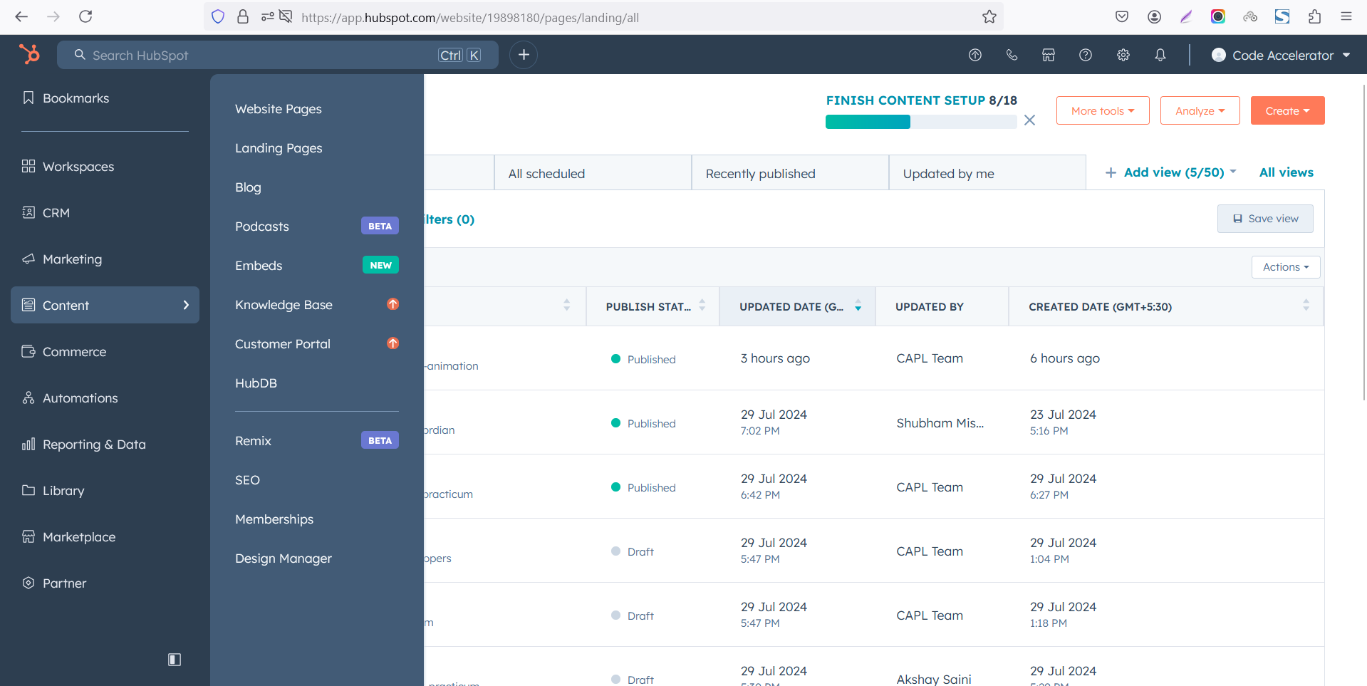 Select the page where you want to apply the module.
-Feb-13-2026-06-36-57-8607-PM.png)
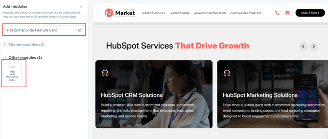
Search for "Horizontal Slide Feature Card" and drag and drop the module into the desired location on your page.
Module Defaults Options:
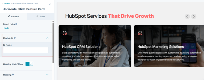
Layout ID :
Easily enhance navigation by adding an ID to the target section and using the same ID in an anchor link. This enables a smooth scrolling effect when users click a Call-to-Action (CTA) button, improving the overall user experience.
Heading :
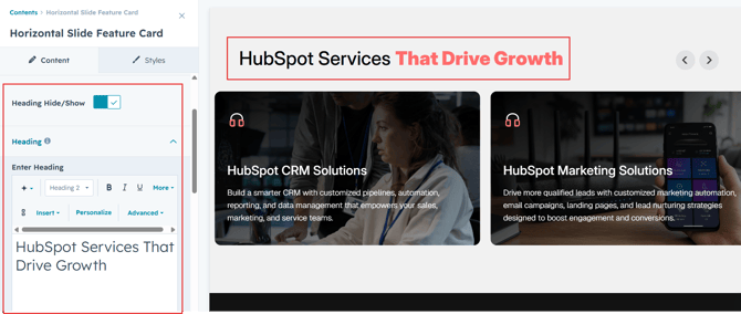
You can change the heading with show/hide allowing for a flexible and customizable user experience.
- Update the heading
- Easily manage and organize how content is shown based on user interaction
Slider Content :
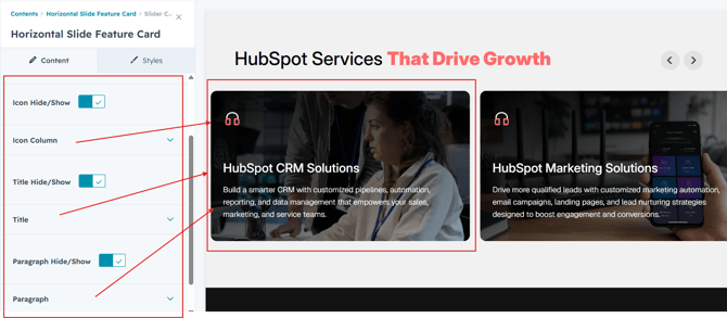
- Image Icon & HubSpot Icon
Choose between custom image icons or HubSpot's built-in icon library to match your design. Easily switch or update icons directly from the HubSpot editor without any coding.
-
Title
Enter a compelling title to capture attention and clearly communicate the success story. - Description
Provide a brief overview of the project, challenge, solution, or results. Use this section to share key details and achievements. - Background Image & Color
Choose between a custom background image or a solid background color to match your brand. Easily update the background style from the HubSpot editor without any coding.
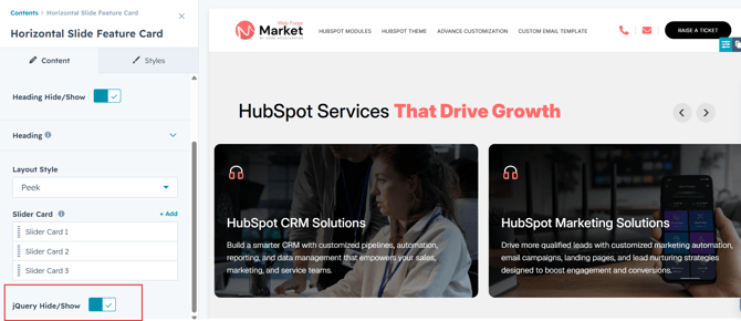
jQuery Add/Remove :
Users can add or remove jQuery JavaScript as needed, providing flexibility to enhance functionality or optimize performance based on their requirements.
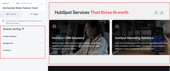
Module Style Options:
Module Setting :
Adjust the margins, padding and background colors to achieve your desired look and feel for the module. This flexibility lets you fine-tune the layout and aesthetics, ensuring your design is both visually appealing and user-friendly.
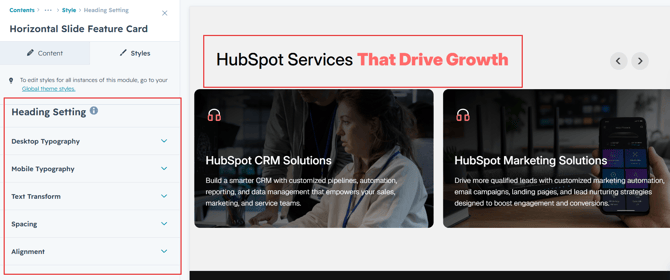
Heading Setting :
In this module, you have full flexibility to customize the heading to perfectly align with your design vision. You can easily adjust the spacing around the text, apply text transformations such as uppercase or lowercase, and set the alignment (left, center, or right) to create the ideal layout. These options ensure your content remains visually balanced and responsive across all devices.
- Text Styling Options
Set font size, color, spacing, and apply text transforms like uppercase or capitalize. - Responsive Alignment
Align your content (left, center, or right) for both desktop and mobile devices. - Spacing Adjustments
Add padding or margins around your content to create visual balance.
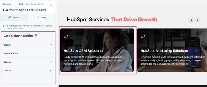
Slider Card Setting :
You have full control over customizing the column box to align with your design preferences. Adjust the spacing, overlay, border and corners to create the perfect look for your layout. Tailor these elements to ensure your content stands out and blends seamlessly with the rest of your design.
- Spacing Control
Adjust the padding and margin to create the ideal distance between elements and prevent overcrowding. - Border Styling
Set borders with customizable width, color, and style to frame your content attractively. - Corner Radius
Round the corners to create smooth, modern edges for a softer design.
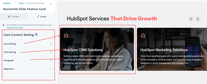
Slider Card Content Setting :
Take full control over your column content by customizing the typography, spacing, and alignment to match your brand's design style. You can adjust text transform options, icon size to make them stand out. Whether you’re updating typography, or configuring borders every detail can be tailored for a cohesive and visually appealing look.
- Typography Customization
Adjust font size, style, and color for headings, descriptions, and other text elements to create a consistent visual identity. - Spacing & Alignment
Control padding, margin, and text alignment to ensure optimal content positioning and balance. - Text Transform
Modify text case and style (uppercase, lowercase, capitalize) for better readability and emphasis.
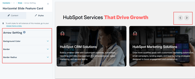
Slider Arrow Settings :
Customize the slider arrows with your preferred background color, border style, border radius, and icon color. Easily match the arrow design to your website's branding and overall look.
We hope you enjoy using our horizontal slide feature card module to create a seamless experience for both your users and your marketing team. At Code Accelerator, we're committed to ensuring your HubSpot experience is exceptional. If you need a custom HubSpot module or require a tailored HubSpot CMS or CRM setup, please don’t hesitate to Contact Us.