
The Contact CTA Banner Module showcases company details, services, achievements, and key business highlights. Customize headings, descriptions, statistics, CTA buttons, links, and styling directly within HubSpot. Its modern, responsive design delivers a polished experience across desktop, tablet, and mobile devices. Perfect for building trust, increasing engagement, and encouraging visitors to connect or convert.
Key Features of a Contact CTA Banner Module :
-
Customizable CTA Banner Design – Create eye-catching contact banners with flexible layouts, headings, descriptions, and supporting content.
-
Responsive Design – Optimized for all screen sizes, ensuring a flawless experience on desktop, tablet, and mobile.
-
Flexible Content Options – Easily update headings, descriptions, and CTAs directly within HubSpot.
-
Customizable Visuals – Add images, graphics, or mockups to match your brand identity and campaign goals.
-
Engaging Call-to-Actions – Drive conversions with customizable CTA buttons tailored to your business objectives.
-
Design Flexibility – Adjust spacing, alignment, and background colors for a unique, on-brand look.
-
User-Friendly Editing – No coding required—built for marketers to launch modern hero sections quickly.
-
Optimized Performance – Lightweight and SEO-friendly to ensure speed and visibility.
-
Versatile Use Cases – Perfect for homepages, landing pages, service showcases, or campaign launches.
How to Set Up the Use Contact CTA Banner in HubSpot :
In the main dashboard, go to the ‘Content’ tab and select either ‘Website’ or ‘Landing Pages,’ depending on where you want to add the section. This lets you choose the right location for managing or updating your content.
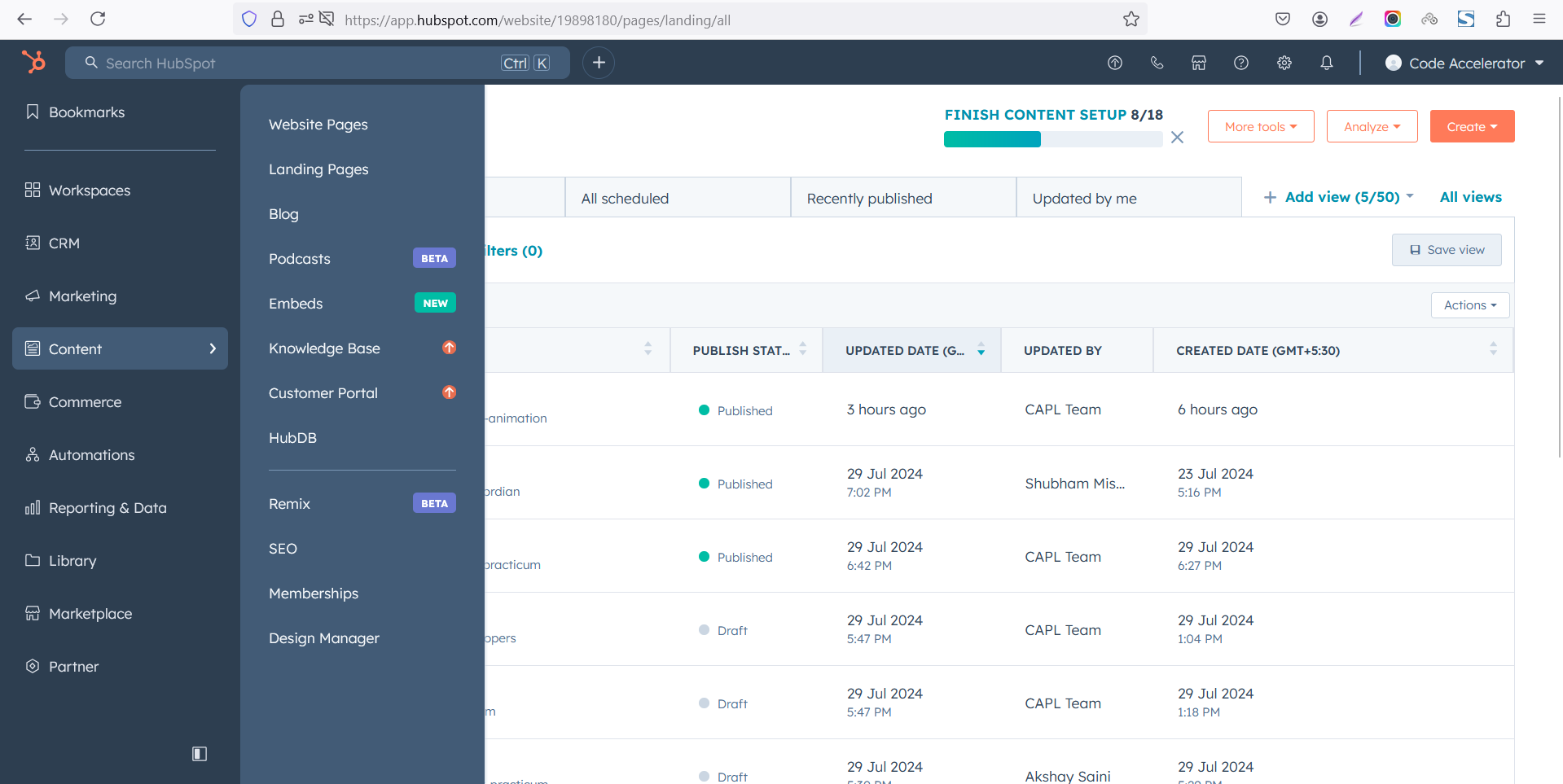 Select the page where you want to apply the module.
-Feb-13-2026-06-36-57-8607-PM.png)
Search for "Contact CTA Banner" and drag and drop the module into the desired location on your page.
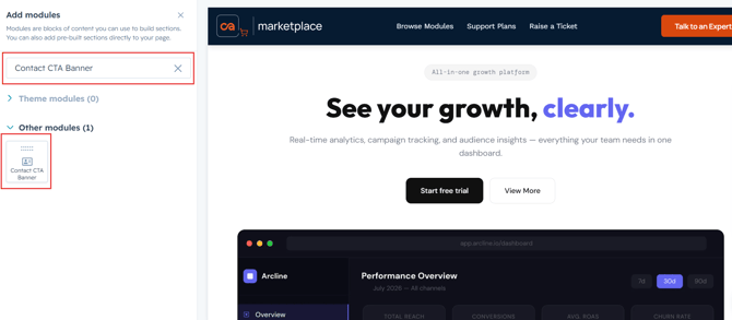
Module Defaults Options:
Layout ID :
Easily enhance navigation by adding an ID to the target section and using the same ID in an anchor link. This enables a smooth scrolling effect when users click a Call-to-Action (CTA) button, improving the overall user experience.
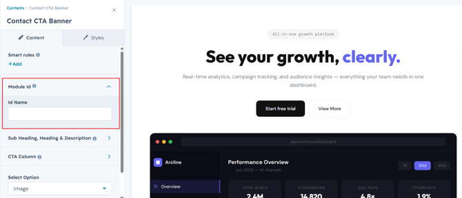
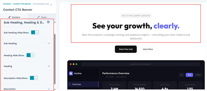
Sub Heading, Heading & Description :
Easily customize the content in your module by modifying the "Sub Heading", "Heading," "Description. You can also choose to hide the section if desired, giving you complete control over the presentation and functionality of your content.
Options :
- Heading/Description & Sub Heading Show/Hide Toggle
CTA Buttons:
Easily customize your CTA buttons by modifying the Button Text, Button Link. You can also choose different CTA options or hide the buttons when needed, giving you complete control over your calls-to-action and conversion-focused content.
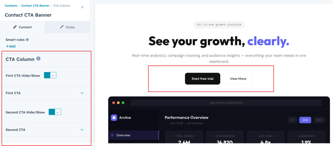
Image and Number Details:
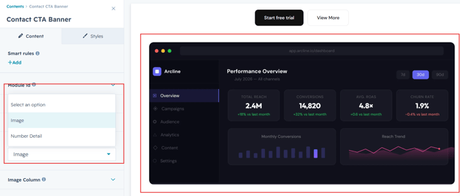
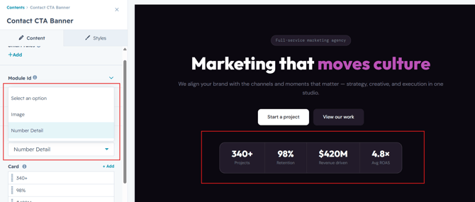
Easily customize your content by choosing between Image or Number details. Add a relevant image or display key numbers and statistics to highlight important company information and create a more engaging visual presentation.
Module Style Options:
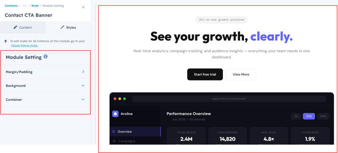
Module Setting :
Adjust the margin, padding, container width and background colors to achieve your desired look and feel for the module. This flexibility lets you fine-tune the layout and aesthetics, ensuring your design is both visually appealing and user-friendly.
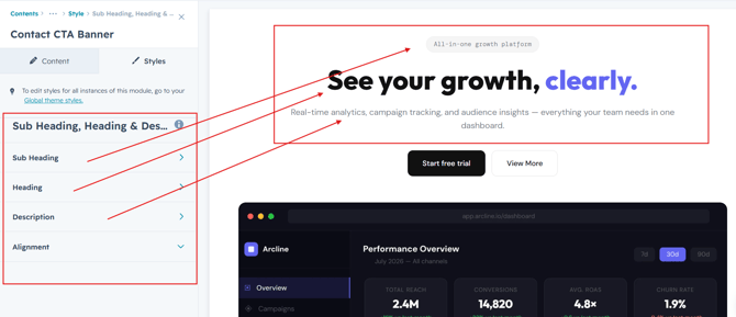
Sub Heading, Heading & Description Setting :
Users can customize the spacing of the heading, as well as adjust the typography for the sub heading, heading and description. This includes modifying the color, font size, weight, and line height for both mobile and desktop views, allowing for a personalized and visually cohesive design across all devices.
CTA Settings:
Users can customize the spacing and styling of the CTA buttons, including button color, text color, font size, weight, border, and hover effects. These settings can be adjusted for both desktop and mobile views, ensuring consistent and engaging CTAs across all devices.
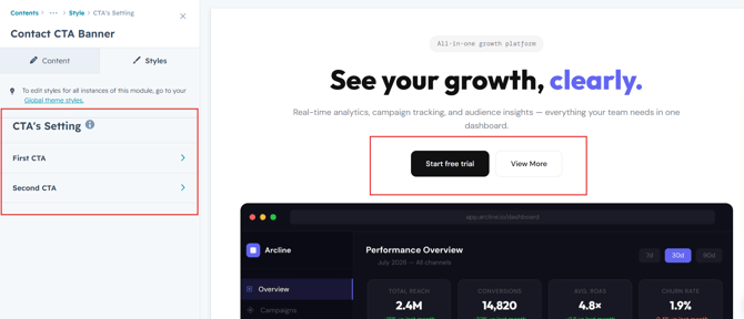
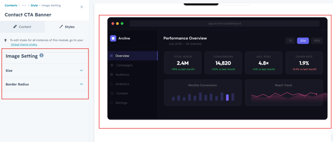
Image Setting :
Image Styling Settings allow you to easily control image corner and size to match your layout needs. And visual appearance to ensure images blend seamlessly with your brand design.
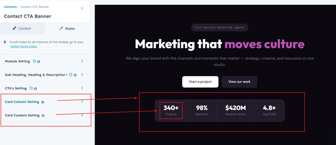
Company Details Settings:
Users can showcase key company metrics such as Projects, Client Retention, Revenue Driven, and Average ROAS. Each detail can be customized with a value and label, helping highlight business performance, achievements, and credibility in a clear and engaging way.
We hope you enjoy using our contact CTA banner to create a seamless experience for both your users and your marketing team. At Code Accelerator, we're committed to ensuring your HubSpot experience is exceptional. If you need a custom HubSpot module or require a tailored HubSpot CMS or CRM setup, please don’t hesitate to Contact Us.